Yet Another Tuner App


YATA
Did another tuner app need to be made? Of course not, there are hundreds available for free. But my portfolio was lacking, I wanted an excuse to learn a new technology, and, if I am being honest, I was disappointed with most of the existing tuners.
They fell into a few camps:
- Unpleasant to look at.
- A tacked on feature to an existing site.
- Overly hyper-specific. (Some tuners only had EADGBe tuning.)
Inverting these complaints established my goal posts:
- Simplicity
- Minimalist
- Theming
- Responsive
- First-class
- Portable
- Standalone
- Lightweight
- Flexible
- Chromatic tuning
- Functional customization
Simplicity and Design Principles
No greed here
Much of the design work was spent on reduction. Both visually and functionality.
What was clutter, and what was necessity?
The design went through a few iterations before finally settling:

Initial designs
The first two designs functionally fail.
By having the accents and/or natural on the edge there are multiple points around the circle that would technically be in tune. Also, sharps and flats are exclusive. It’s rare to care about both at the same time.
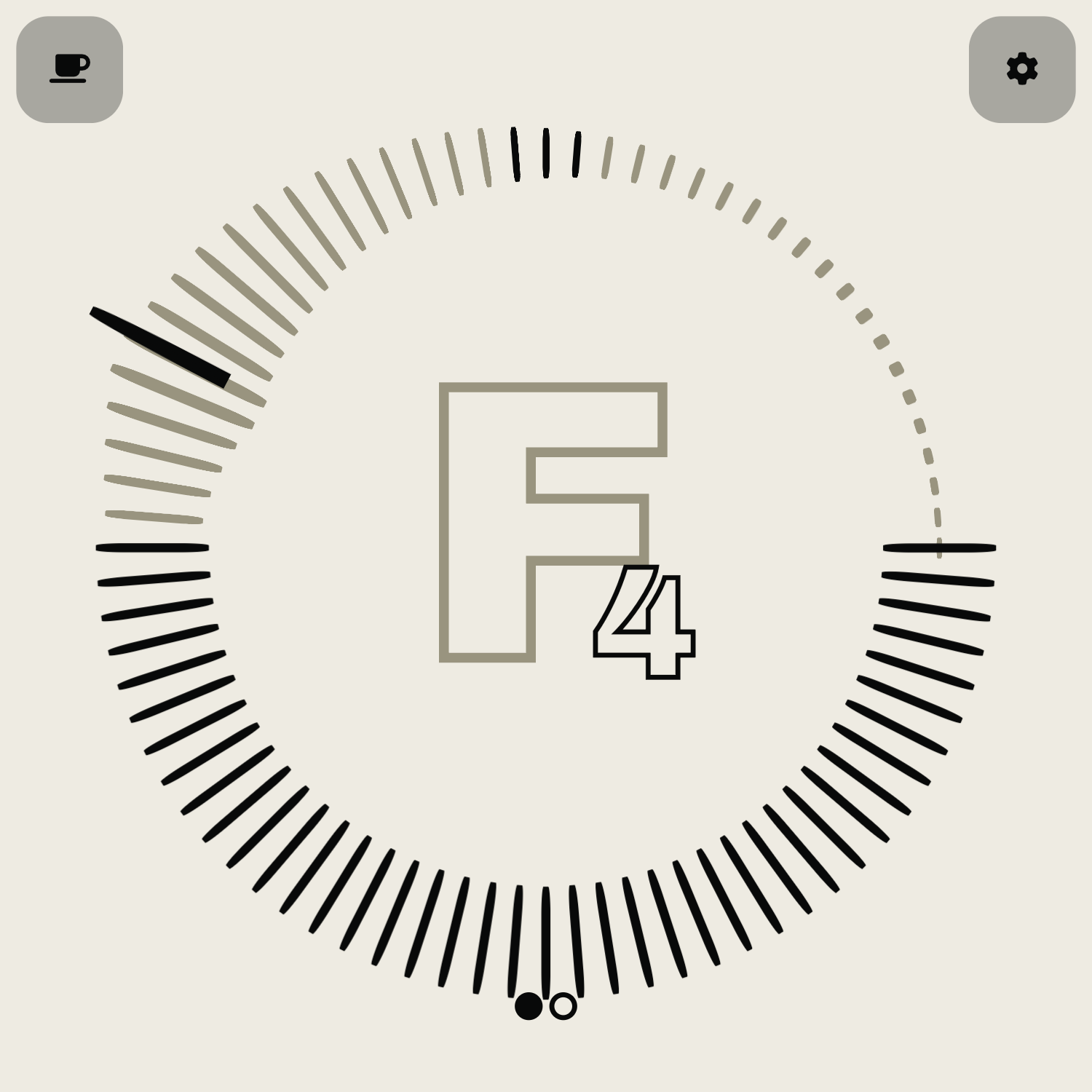
The last three designs are closest to the final product. A note is in tune when the letter is filled in and the dial points up. The accents and octave indicators sit right next to the note itself.
A few different fonts were also considered.
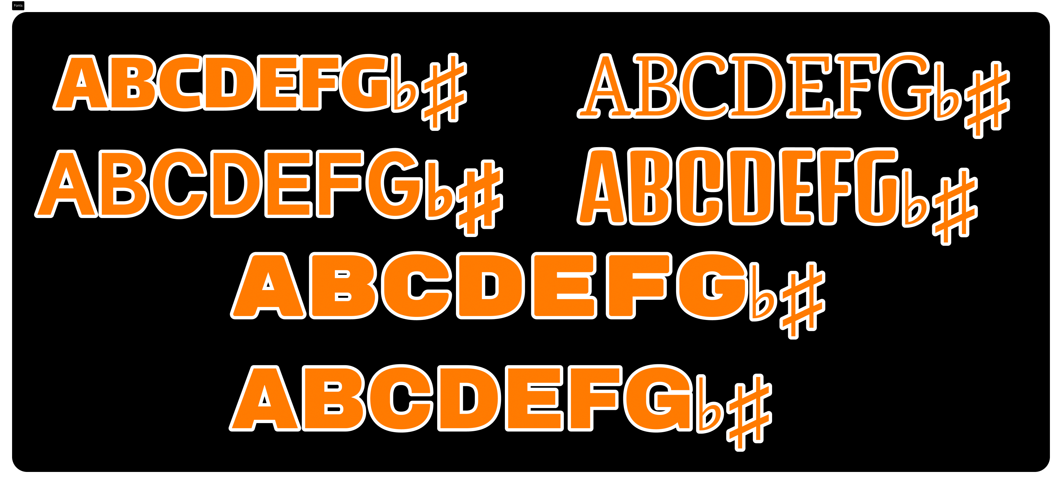
The last one was picked due to its size and monospaced nature. After all, the note would be the focal point of the entire application.
Imitation is the highest form of flattery
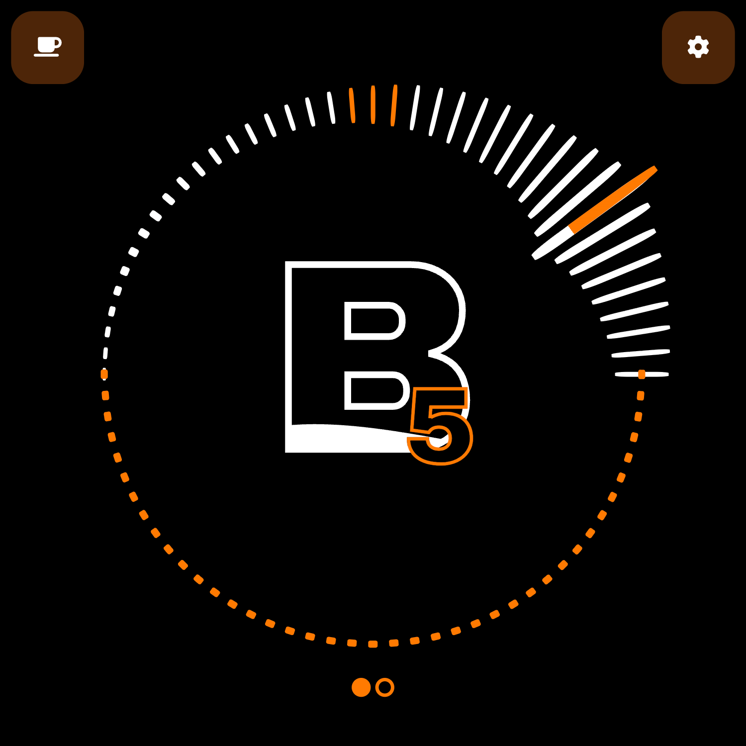
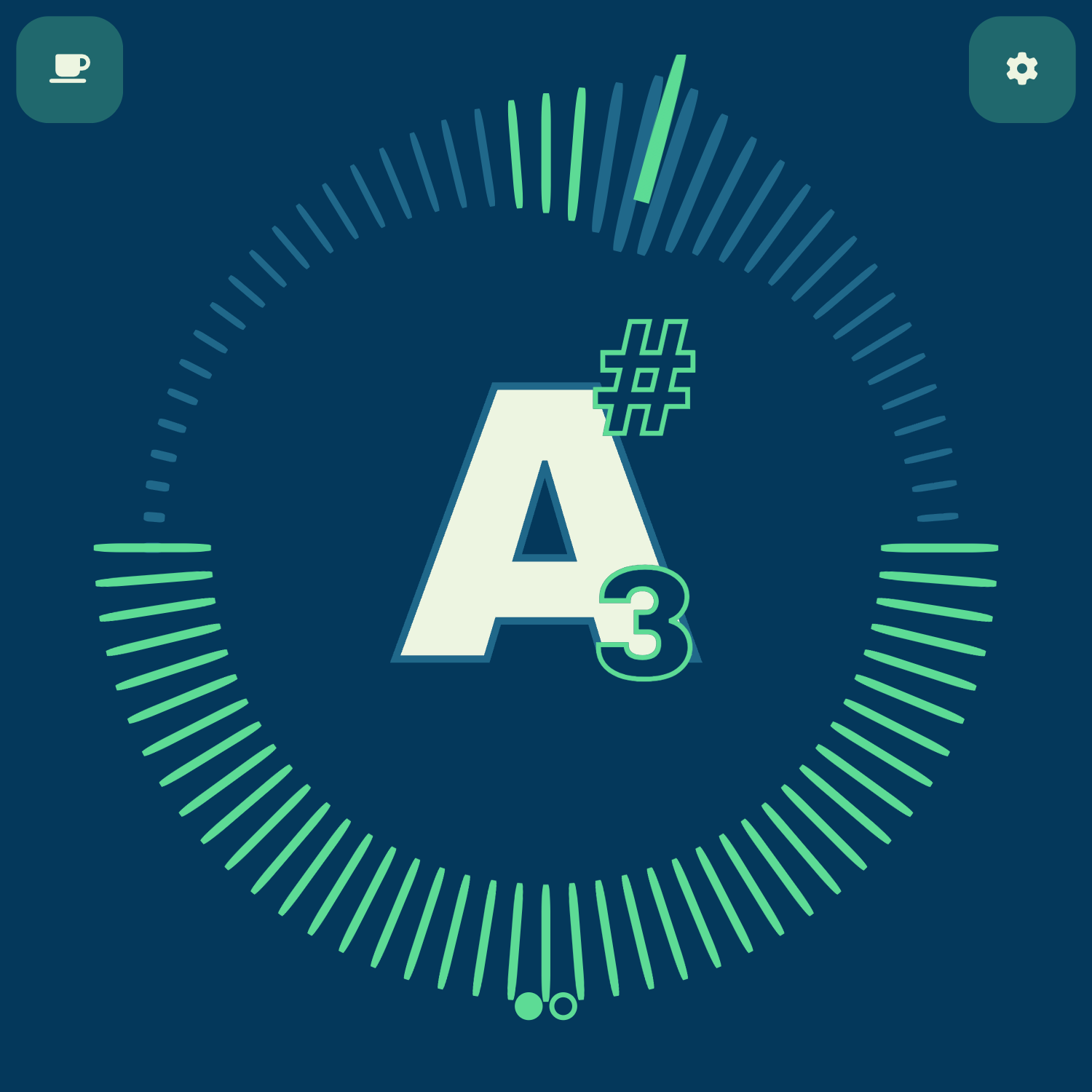
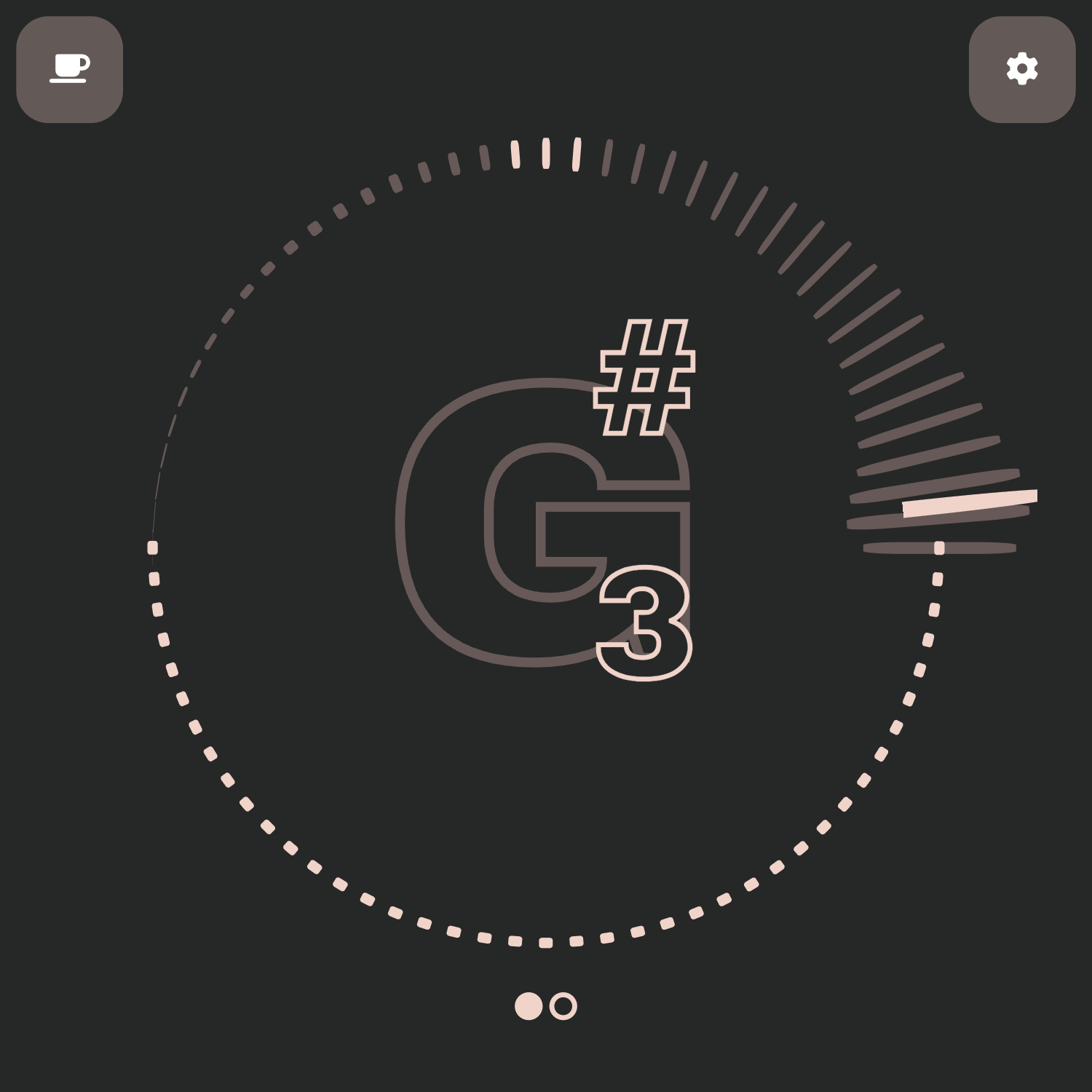
It was important to me that whoever used the app would be able to visually change it however they saw fit.
Initially I had allowed the user to apply any color to the background, foreground, and accent colors using a simple hexcode input field. This was confusing and clunky to anyone unfamiliar with this code. I thought about switching to the color picker input, however, the default web UI stuck out like a sore thumb, and so I pivoted.
I am an avid fan of the website monkeytype for multiple reasons but its approach to theming was exactly what I needed. No messing around with hexcodes, just a simple list of common themes.
And so I stole it.
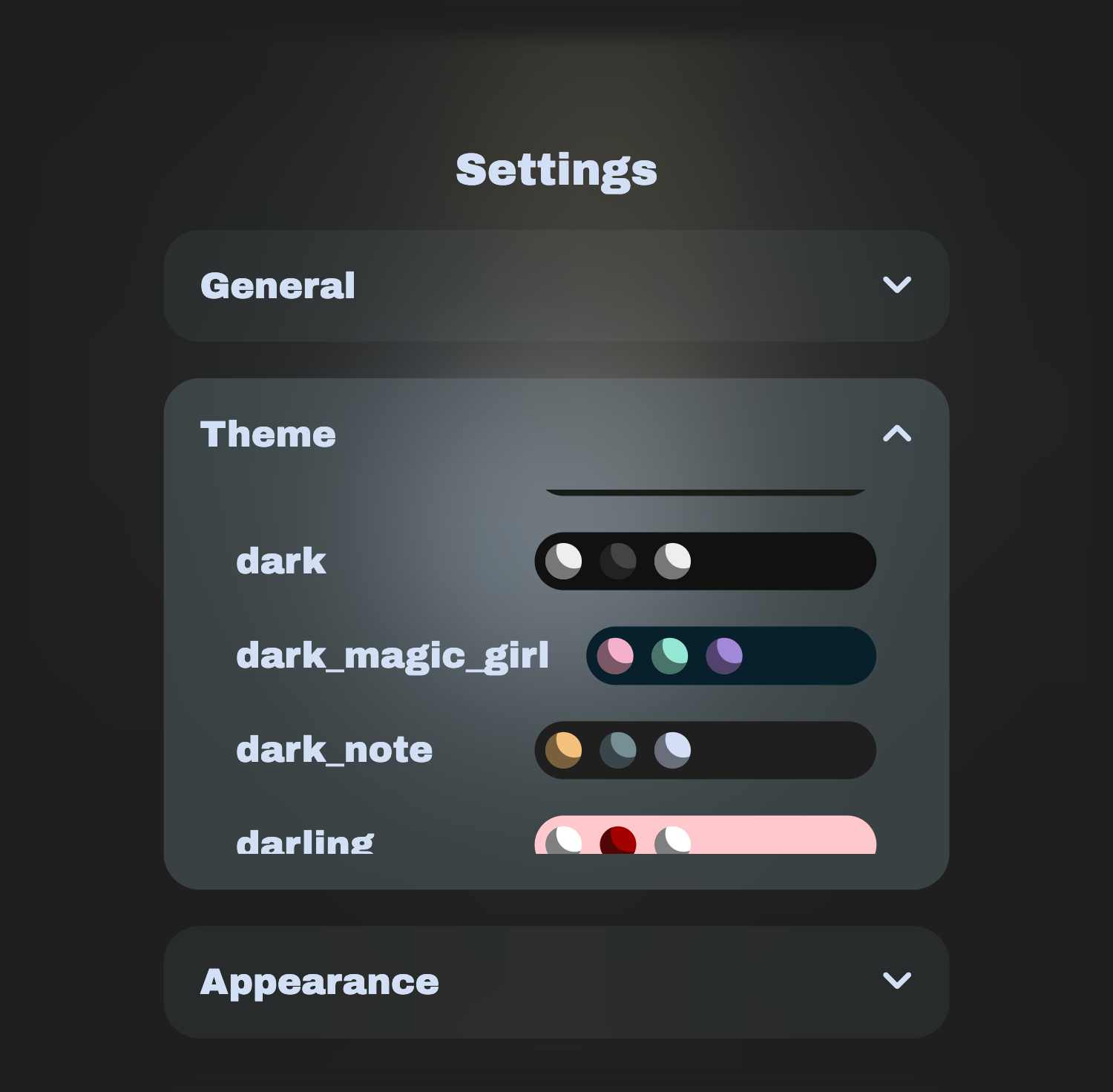
184 themes are currently supported in a simple tap to select list:
Made for ants
The app was designed to fit on a small screen, but can scale to a monitor if necessary.
The tuner itself is made to conform to a square.
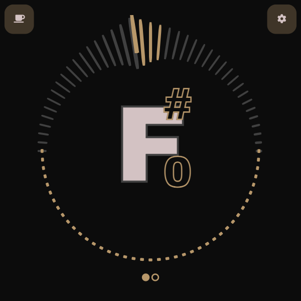
300px × 300px screen
First-class
My website leans left
Progressive Web Apps!
When I began this project I had zero knowledge about PWAs. I was showing a friend who’s smarter than me my progress, and he asked if it had PWA support.
It turned out to be the perfect solution for my use case. I knew hosting the app on a website was the way to go, but I mistakenly thought I was forgoing the ability to have a slick app icon on my phone’s home screen. As a website with PWA support, the tuner can run in the browser or as an offline downloaded application.
You can’t miss it
It’s impossible to visit the tuner and not be immediately met with the function of the site. No header. No footer. No side menus. No ads. Just the tuner.
Don’t break the scale, but a little dessert is okay
Truthfully, the site’s size was not at the forefront of my mind during development. However, the technologies I chose at the outset automatically helped keep things small. There is no framework.
Instead, I adopted lit. Lit provides a framework-like developer experience but builds directly on top of web component standards.
Currently, the website sits around 700KB transferred. This isn’t impressive at all, but good enough is good enough, and it does result in semi-fast loading speeds.
The biggest bottleneck is the CSS loading in the font awesome symbols. This could be drastically reduced, and I may get to it one day.
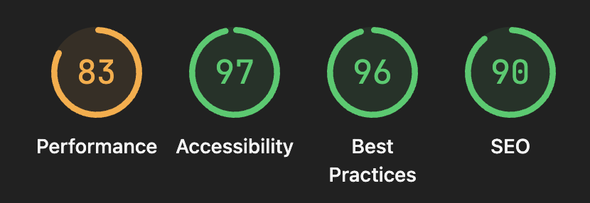
Chrome lighthouse report (Technically better than Amazon and Walmart!)
I have nothing against frameworks. The choice here was for two reasons:
- I wanted to learn a new technology.
- The simplicity of the idea would be bloated by most frameworks.
Frameworks are powerful, but unnecessarily so for my use case.
Flexible Functionality
Leave no note behind
The tuner is fully chromatic with a toggle for flats or sharps. This was simple enough to implement but an important distinction from existing instrument-specific tuners, as it makes the tuner instrument agnostic.
All, nothing, and everything in between
On the outset, I was unsure of which features I would or would not ultimately want. So, I allowed each and every component to be hidden from view.
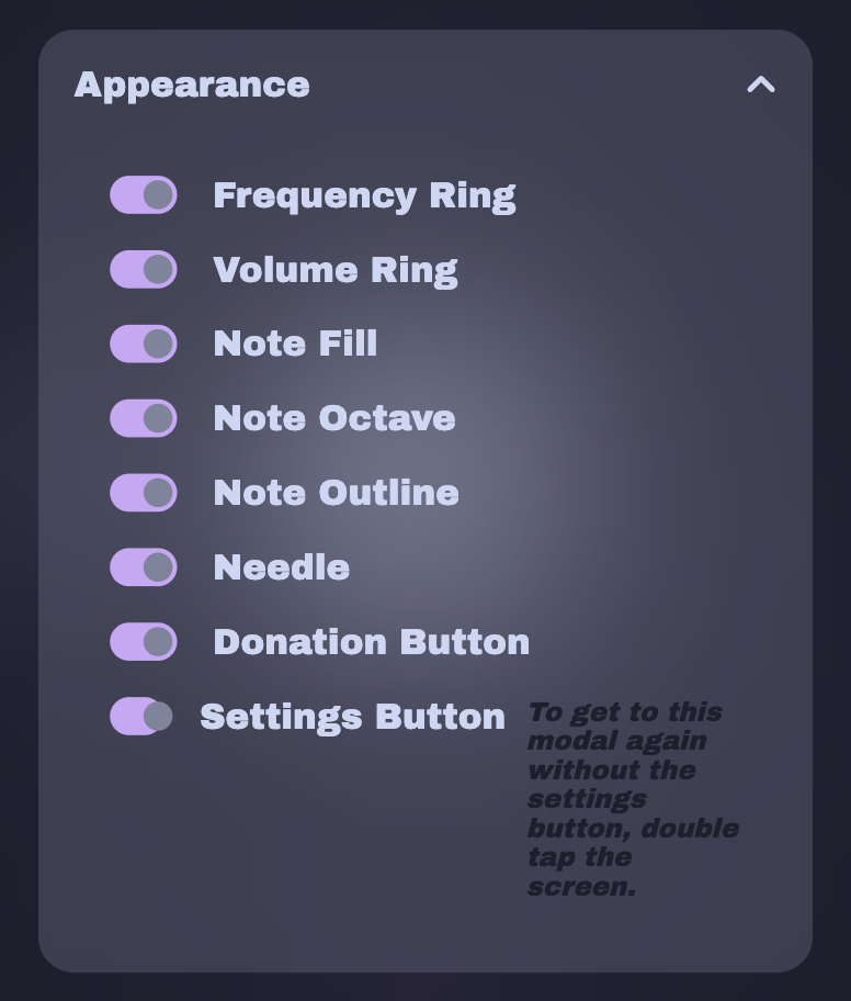
What this means in practice is that someone can choose exactly what they want to see (even if that’s nothing at all!).
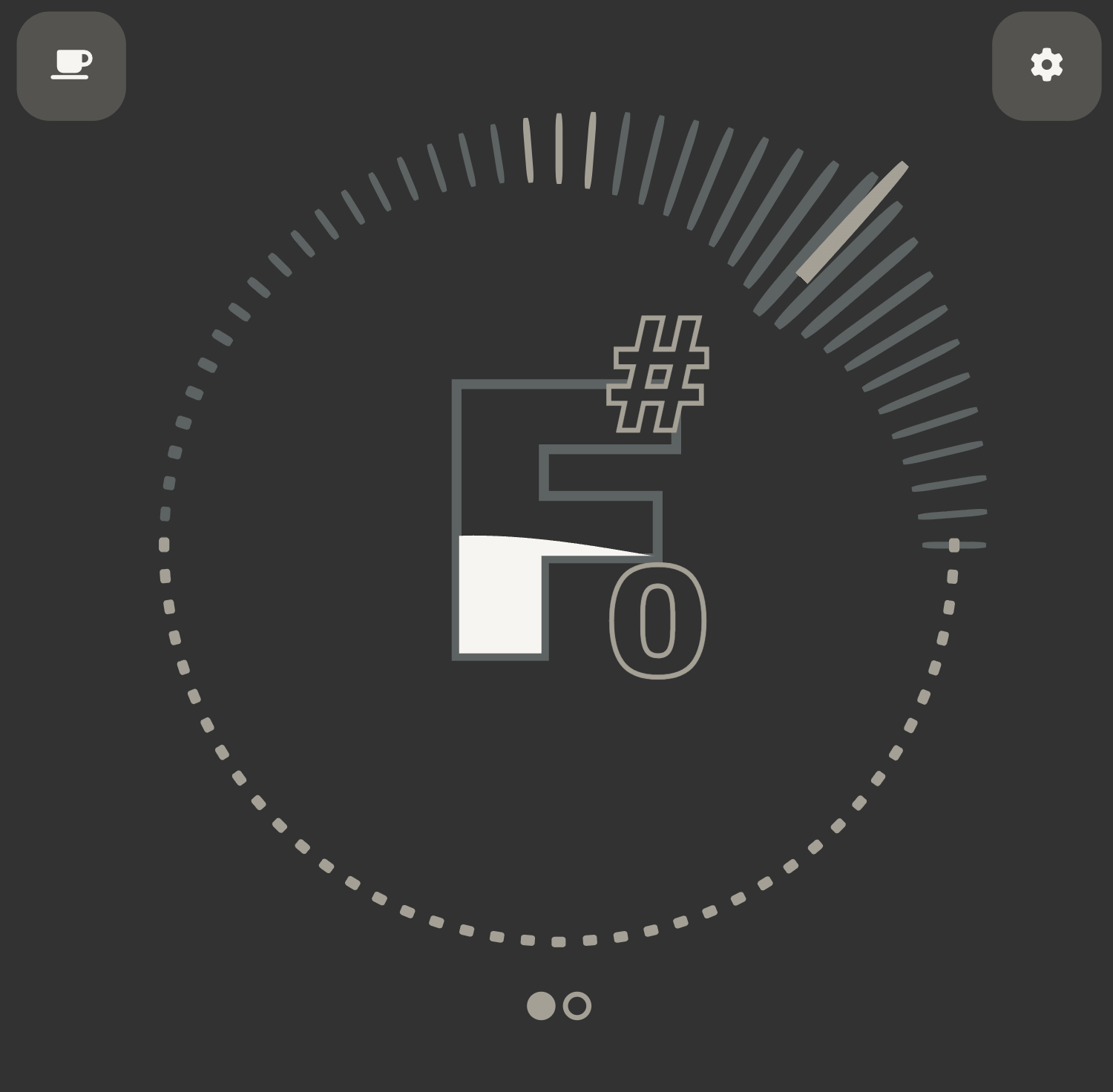
Everything showing
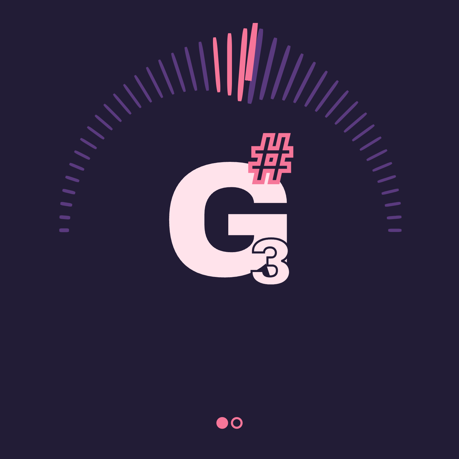
Less showing
Bonus feature!
At the request of my wife (my first user!); the app also includes a pitch pipe. I wasted the perfect amount of time making the spinning as satisfying as possible.
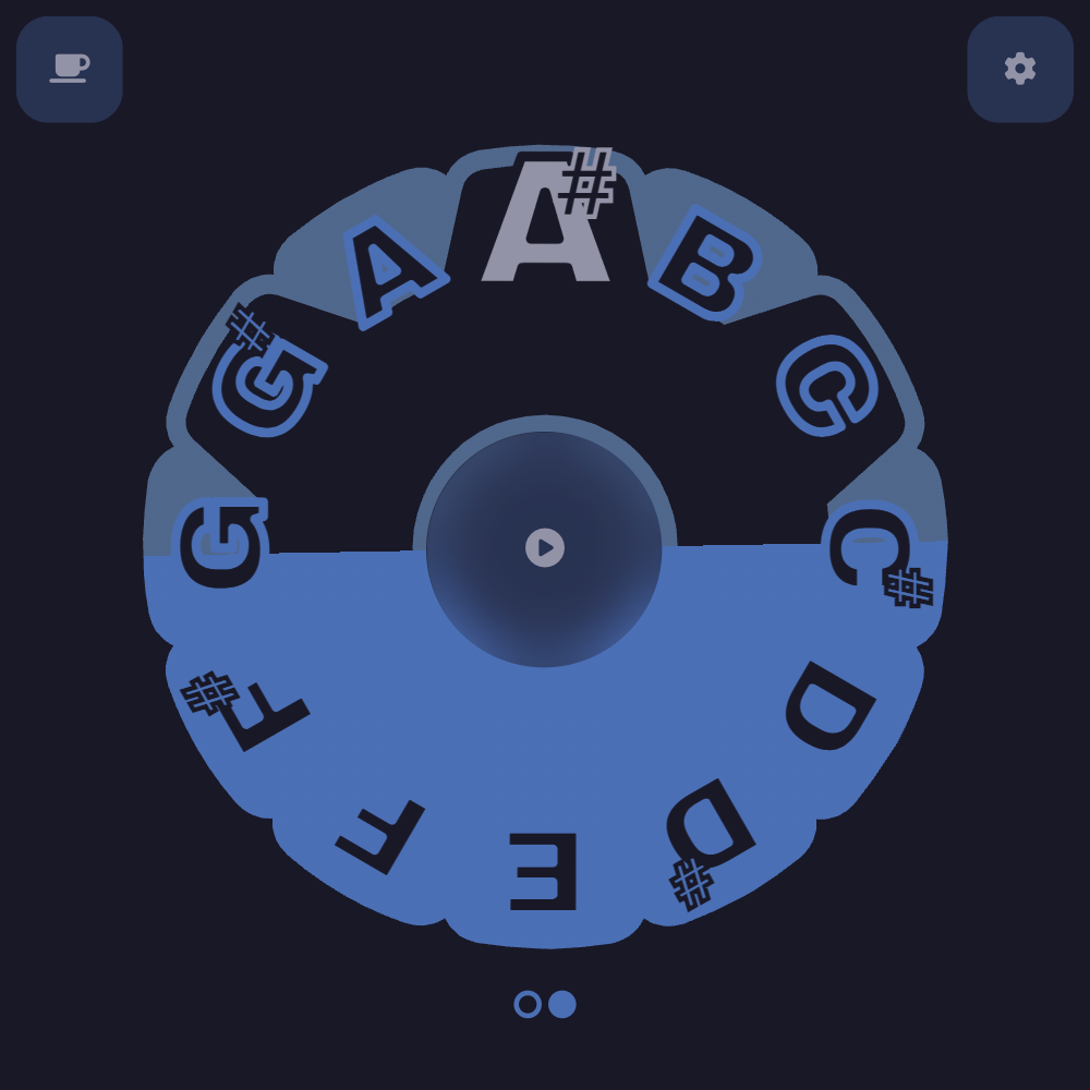
An app I actually use
The best result of this whole journey has been that I actively use the tuner I made.
It is genuinely possible to finish a side project, and actually make use of the finished product.
Crazy.
Anyway, thanks for making it to the end, and as always: Never stop creating.